Thursday, November 29, 2012

New Look of Showers

                 Most people rarely use a bathtub because of our crazy busy days.  I person am a shower person. They are a great way to start your day by getting in and out to be on time for work. In my case, School. I just wish I had a more interesting shower that was not a  more creative then my boring shower/ tub combo. So I started searching for  what i would like my dream bathroom to be. Here are some ideas I came up with.

                I thought this was a creative way to display a shower. Not sure if I would want my shower in my bedroom and to here getting woken up by my husband in the shower. The layout is not ideal but, it is a creative way to combo a master bath and bedroom together.

                   Spa retreat!!! Here I come! That is exactly how I feel when I see this space.  The space is inspired by a Japanese style with wooden accessories. Love the shower head detail with the white and  brown that creates a sense of nature in the space.
              Interesting......Yes it is! When see this picture I envision a  beach shower. The sea shell shape give the shower a geometric shape and a simple modern shower.

 http://www.designlaunches.com/fittings/concept_roca_cocoon_shower_stall_by_arina_komarova_is_stunning.php
             Lets jump into the future with this time machine. O, wait it is a shower. Yes, I did say shower. The shower is actually a rain shower that is installed t the top of the egg shape. I would love to put this in a guest bath just to blow my visitors minds away.


      http://www.archiexpo.com/prod/hydroco/bithermal-vichy-showers-63476-169186.html
                 Would you like to take a shower laying down? Well, here is the shower for you. The shower is usually used in spas and for  for physical therapy.  The shower has seven shower  powerful shower heads that are over head and their  is a handheld shower also.


New Face of Facets

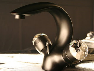
             Facets are the new jewelery  of the bathroom. They had attention to the sink and focal point for the room. Faucets have been transformed from boring to fab with these new modern faucet's.

             The facets above has  the bling on the  handles made of swarovski crystals. This would add a glamorous touch to any bath.
                                          http://www.furniturefashion.com/tag/karbon-faucet
The faucet above is called the  Karbon Articulating facuet by kolher. it is able to full extend and  is movable. Great idea to wash down the toothpaste stuck to the sink! This can be used in a kitchen or bathroom setting.

                    I found this interesting picture from Pintrest that has antique faucets . I like the placement of the  faucets. One faucet is placed above the sink and one is place on the side of the sink. Great attention to detail for a bathroom.
 

                     The above faucet is called conceptualized and designed by " A DIF POV Design Solutions  which is located in Portugal. The octave  shape has a control at the base  that lets  you control temperature and amount of water being used.
                 The fan shape faucet above is a simple but exotic style.  This product is made by Yatin. It is a simple geometric shape forms  that let the water flow smoothly into the sink.

Wednesday, November 28, 2012

Glam that Bathtub


                Bathrooms are the forgotten place when it comes to design. The common and simple bath rooms just have a shower and tub combos. Yes, they are easier to install and cheaper....But where is the GLAM! Here are some over the top glamorous bathtubs sure to blow your mind. 


http://lusy-http://lusy-decorasirumah.blogspot.com/2009/12/glamorous-bathroom-interior-design.html
             The hip bathroom is especially designed for a teenager with splashes of blues, purple and pink. The floral pattern is  disperse throughout the room to create this theme. Bath tub is a unique claw foot tub or in other words a ball foot tub.


       Simple but, elegant is the name  of this bathroom. Plain white walls create a relaxing  room with the texture part of the wall enhances the stainless steel finish on the tub.  The windows balance the room with symmetry and cause the eye to move up to vintage chandelier. Adding a texture rug to this space that has a sparkle of silver in the material creates a cohesive look throughout.

                             
Rustic and charming  bathtub area displays a old world feel with grayish bricks that look old and worn.  The molding and draperies surrounding the room in  a touch of modern.  Love the  display/ storage area above the  draperies. Pops of gold enhances the room to look glamorous and unique.
                               Glamorous Bathroom Interior Design
http://www.i9u.net/stylish-bathroom-interior-design-from-kaldewei/glamorous-bathroom-interior-design
        I just love how black can enhance any space. The black floor  and the bathtub give the illusion of the tub floating in the middle of the room.  Love, Love, Love the wall covering with the vertical  stripe pattern with a damask pattern. The idea of the black frames against the red wallpaper  pops the walls out anymore.


lineatre_luxury_bathroom.jpg
http://www.luxurylaunches.com/fittings/lineatres_gold_componibile_furniture_transforms_the_bathroom_into_a_luxurious_haven.php
          I thought this bath/shower idea was very brilliant! Instead of a simple boring surround for a bathtub combo here is one created  to look like a piece of furniture. The ideas are endless and you can create anything to a tub, shower head, or vanity for a bathroom. I will keep that in mind when I start to remodel bathrooms. :)

Tuesday, November 6, 2012

Jump Aboard the Island!

 
Kitchen islands are a must have in a kitchen. They help add extra seating, storage, ans space for appliances. We just finished making designing our kitchen project and  having a unique island idea can help any kitchen look glamorous. Here are some items that can be done for your kitchen islands.


  http://blog.kitchendistributors.com/kitchen-design-ideas/design-ideas-for-unique-kitchen-islands/
         In this elaborate island there is a unique storage area. The storage is for dog food. All you do is grab the handle and open it and you can scoop any of your dogs favorite food. this would also be a great idea for cereal for a house full of kids.

      This island is just a simple one with a protruding rounded island. At fist I thought it was a actual table. The island creates a floating effect and a crisp clean area to have drinks.

 
            I love this slim island! The detail of the countertop and how it curves on the sides adds an interesting focal point. When I think of a kitchen Island I think of  bulky and big. In this one it is simple and sleek to keep the space modern.
 
          An another unique way to add seating to an island would to add a banquet. A banquet is  simply just built in seating. This would be great for a family that entertains alot.


                          http://classicchichome.blogspot.com/2011/06/kitchen-island.html
           Here is a interesting way to display your accessories that have been collective through out your life. It is very symmetrical with the storage on each side and the columns  to add a architectural detail. Glamorous way to dress up any kitchen space.

Thursday, October 18, 2012

A Punch of Detailed Ceilings


Ceiling are known as the forgotten leftovers of the home. Most homes have a old fashion texture ceiling... that can be quit annoying at times. As I am starting to add detail to my Kitchen project,  I wonder how I can make the ceiling interesting without forgetting about it. The below pictures show interesting punch of detail.


        Bead board on the ceiling? Yes, that is bead board on the ceiling. Most think of bead board to be used on the walls and to add decorative interest to a space. Bead board on the ceiling creates a unique clean and crisp look for any space.

      Beams are the most common look for a ceiling. You bring in a rustic and traditional style without making the room look to traditional  The stainless steel appliances help balance the room with a modern touch and the textured cabinets enhance the  beams.

http://www.kitchendesigns.com/planningoptions.html
        Coffered ceilings are a classic look that is used in plenty of period homes. It creates architectural elements to any space and a 3d effect to  the ceiling. I like how the floor in the space silhouettes the  cofferedceiling in a the same pattern. I just love coffered ceilings! 
       Metallic on the ceiling? Actually metallic ceilings are very well known and have been used for years.  metallic ceilings create a texture look with patterns and lines. Can't forget how it helps bounce light around the space. This is especially important in a kitchen to help have enough light for creating those wonderful family meals every night.

 .
      I know it sounds crazy but, yes  that is  planks on the ceiling. This planks are whitewash planks applied in a horizontal manor. Planks on the ceiling create a linear effect to the space instead of  putting it on a floor. After looking at all these ideas, I might have found what I am going to use for my project. Just don't forget to add detail to your leftovers!

Tuesday, October 16, 2012

Make a Splash with Tile


      The thought of designing a kitchen can be overwhelming. How much is it going to cost? What materials do I want? Most important what kind of tile should I use as my backsplash. In our kitchen, bath and lighting class we started to learn what tile is great for kitchens. Here are some examples of just a couple.

     Glass tile as shown above, can be use to create wonderful mosaic backsplash or used as a backing to pop out a shelving. When it comes to glass tile it is good for the environment.  glass tiles are also great for creating a mirror effect to reflect light in a space. Glamorous way to add interest to your kitchen.

       Subway tile is usually used commerical spaces and period homes.  The tiles are mostly installed horizontal to create a linear effect. Installing subway tile is easy. All you have to do to install subway tile  with a flat tile surface with pencil thin grout lines. Elements like trim can help enhance the subway tile.

kitchens - white kitchen cabinets marble subway tiles backsplash  Gorgeous kitchen with white cabinets and marble subway tiles backsplash.
http://www.decorpad.com/photo.htm?photoId=93526
        Marble tile is very beautiful with whirling pattern of texture. However, it has  lots of disadvantages. Maintenance is high and needs to be sealed on a regularly bases. Marble does stain easily. This is a gorgeous product but, not recommend for a house full of children.


 http://www.interiordesign-news.com/kitchen-tile-backsplash-ideas-for-beautiful-and-attractive-kitchen.html
    Mosaic Tile is a very popular in lots of spaces. The concept of using mosaic tile is create an interesting focal point in the room. All the tiles come in different shapes, styles,textures, and patterns.  The top mosaic is done with tiny metallic tile in diverse shapes and directions. I love how they put it over the stove to create a fabulous focal point. The bottom photo is a unique design. it is tile that are pieced together to create a mural of flowers on the wall. The detail of cascading flowers enhances the modern space with a pop of feminine touch.  Tile can be overwhelming but, by finding the right  one for your space......IT CAN LOOK FABULOUS!

Sunday, October 7, 2012

Creative Kitchens


 The heart of the home is the kitchen. We all eat, relax, and come as a family in this space. There are all kinds of kitchens styles that reflect us as a family or individual. The following creative kitchens are design for each personality.

This modern kitchen is sleek with the stainless steel. The ceiling has a splash of rustic with the exposed beams. All the items are very lineal and are clean straight lines.
 
 
              http://theinspiredroom.net/2008/11/05/inspiration-for-a-creative-unique-kitchen/
              I love the cohesiveness of the color dispersed throughout the space. The main color red gives the space a focal point to the room. Having a bright color like a warm color, helps drawl the eye into the space. The pops of yellow, blue, and green creates a dilute of the main color.


                           This space reminds me of a global feel. Lots of texture feel the room with touches of nature. The hula skirt  and distressed wood brings nature from outside to inside.
 
This kitchen has crisp white cabinets with lots of color surrounding it. A main color of green  enhances the room with with color. A floral backsplash adds texture and pattern to the space. Accent piece help bring the room together.
      Love this Glamorous kitchen! The crisp white cabinets and the lighting placement  illuminates the room. A Serene  backsplah carries the classic look through out the space. The molding at the top of the cabinets and some blue tile on the bottom of the cabinets caress the one wall with texture. the best part of this space is the the chandelier! Love, love, love it! It anchors the seating area and does not hang to low.